
Sometimes the best path to growth goes back to your roots. That’s what Sisu Healthcare IT Solutions, a company serving hospitals and clinics in rural communities, discovered in the process of rebranding.
Sisu’s business was healthy. But their brand didn’t reflect their energy or direction in a shifting healthcare landscape.
To move the new brand in the right direction, we needed to align Sisu’s image with its essence. That meant tapping into to its strong ties to small communities, and understanding of what makes rural healthcare tick.
The identity we developed unites those roots with the sense of technology-driven vitality.
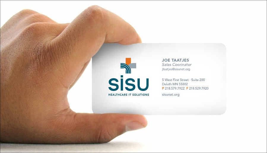
The “thrivemark” speaks to Sisu’s growth, and the health of the communities it serves.
The brand identity came to life on the new Sisu website.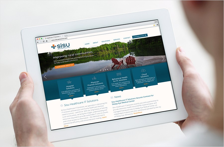
Now that they look like who they really are, Sisu is energized to take the next steps forward, moving to extend its reach from the Midwest to small communities nationwide.