
It was a pivotal point at MIVI Neuroscience.
Looking ahead to two major product launches up the road and wanting to energize their rapidly expanding team around a shared vision for the future, the time was right for a rebrand.
The brief was simple: Show the company’s unique passion for developing transformative stroke solutions. And make it something they would be happy to wear on a company jacket.
![]()
From a range of logo options in different styles, MIVI landed on a calligraphy-inspired mark that suggests both the devices the company sells, and the brain itself.
![]()
Since MIVI did not want to carry the palette from their legacy branding into the new brand, there was a big decision to make. What color should they be going forward?

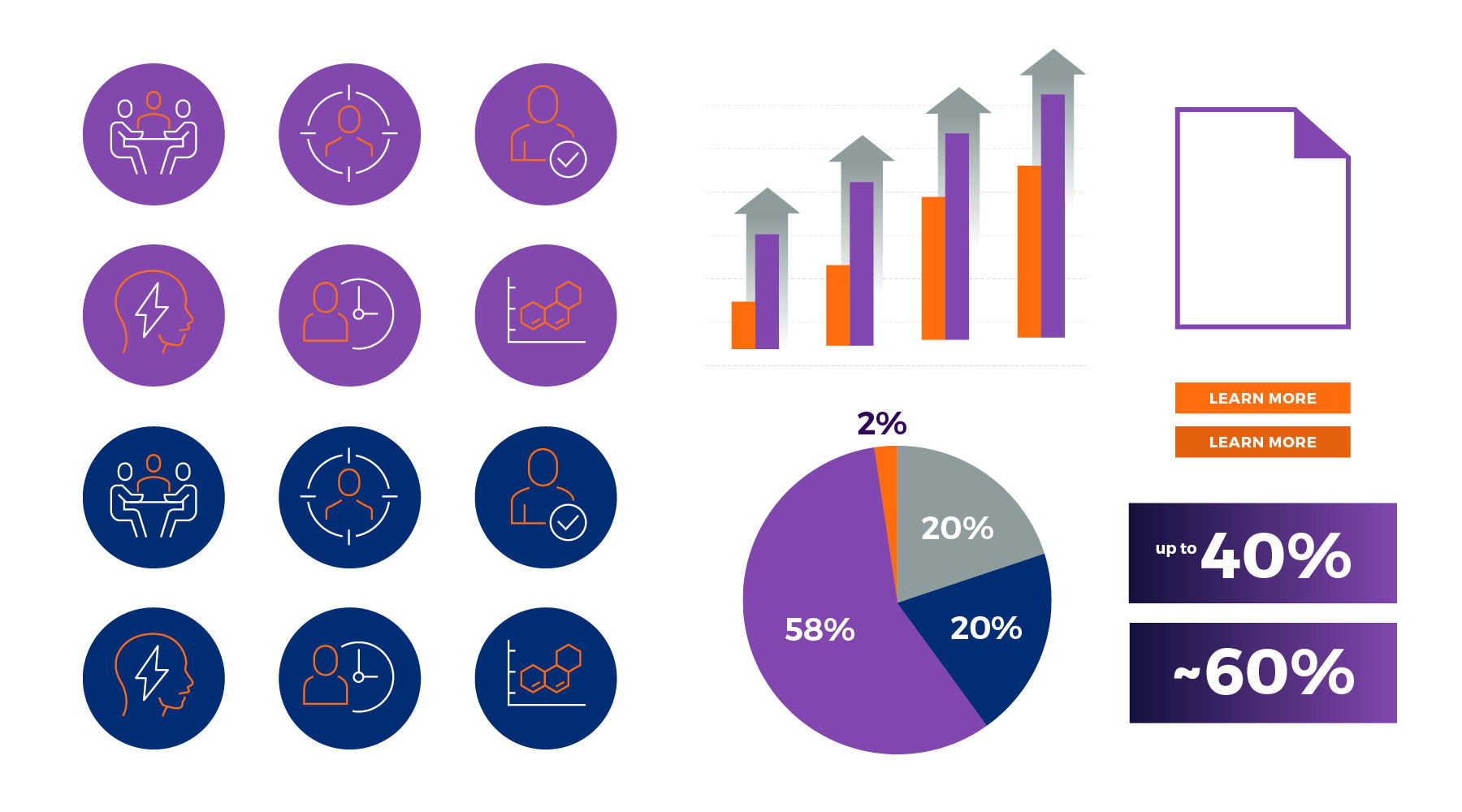
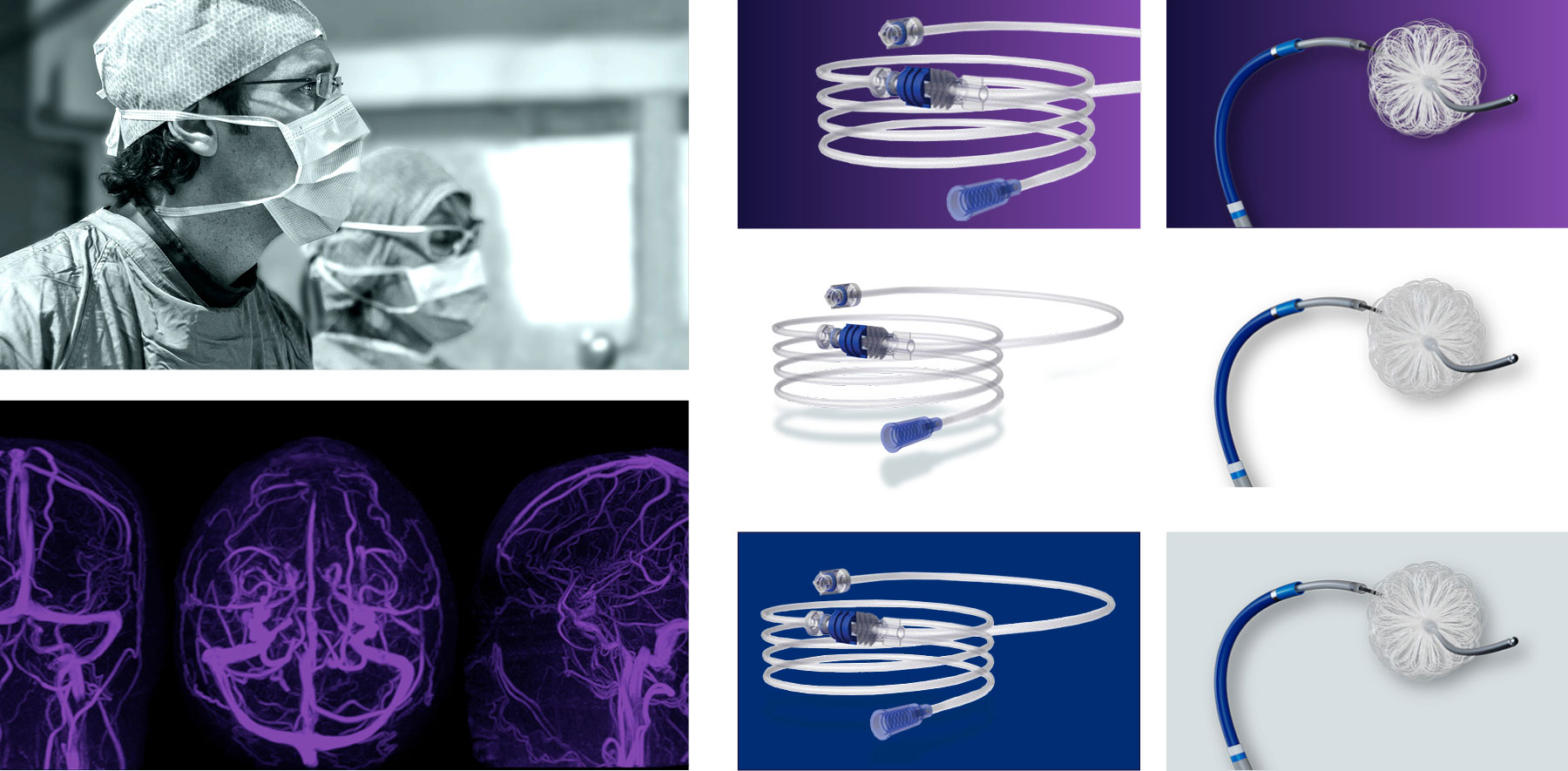
MIVI rallied around purple, a color that stands for passion, something MIVI brings to its mission of innovation in stroke solutions every day.
![]()
As a Minnesota company, the nod to Prince (and, sigh, the Vikings) felt right.
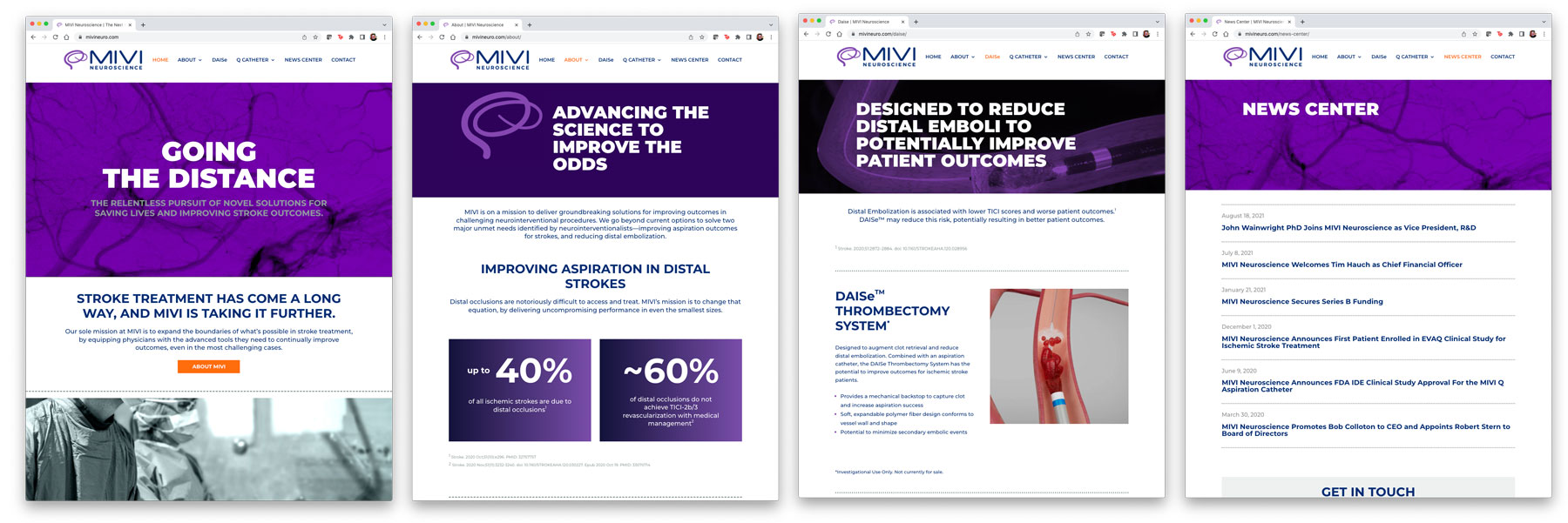
The new brand got its first outing in the company’s new website, designed to showcase MIVI’s growing leadership in the stroke space to all stakeholders.